Showing posts with label Drawing. Show all posts

Saturday, January 27, 2018

Creating my own characters Stage 5 - Color scheme

Creating My Own Characters Stage 5- Color Scheme 

Stage 5 is the last stage in creating my characters. In stage one I developed their personality's and body structures, stage 2 was facial structures, stage 3 combining the body with the face and stage 4 was the outfit/costume design. In stage 5 i will be talking about how you can use the color scheme to enhance your characters personality and give them a little more of a lively look. Because my characters have different outfits I will be talking about the edgy side and and elegant side of the color scheme. 

Vicky

Vicky's outfit was created in stage 4 and it was based on a Laura croft design that I saw, I used the Laura Croft photo as my inspiration for both the outfit and the color scheme.  Due to the fact that her outfit is a lot edger than Eric's and plays with her sarcastic character, most of it is black or a dull gray. Her pants are the largest part of her outfit and I kept them black with the rings around her knee and thigh white to draw more attention to those areas. "Make the large part of the outfit a duller color to draw attention to the details" (Brooks 72). There are a few pops of color in her outfit like the red lipstick, the blue case she has strapped around her left thigh and the vibrant purple long combat boots. I gave her a dark pecan colored brown hair color and to match her hair a coffee eye color, both of these colors pop out on her caramel skin tone. Another detail I added was the black streaks in her hair to show hoe here hair is parted and or styled. The colors work together because they are a lot of dark warm tones with pops of cool tone when working with a edger outfit.


Eric 


For Eric's costume, because it is a lot more elegant and classier I didn't add as many details that would pop with color because i wanted the main focus to be on the suit itself rather than the details. To show that there are details without a difference of colors I just changed my shading, the fold and creased parts of his suit are a lot darker than the parts that are just flat material. Tip: outlining is the most important part if you want something to stand out. I outlined Eric;s suit because I wanted to show how it hugged it figure and gave him a little more dimension than before. The shirt under the tie and the suit is a crisp white because it give the outfit a more refined and classier look making Eric looking more professional. "The key to a men's outfit is the subtle mix of darker colors than bright colors" (Brooks 76).  His  dark brown shoes and the while buttons on his vest play as those little subtle details and wrap the outfit.


That was it for color scheme and I hoped you enjoyed coming along with me as I created and developed Eric and Vicky. :)


How did you characters come out? Did you enjoy this blog?


Brooks, Josiah. Draw with Jazza - Creating Characters: Fun and Easy Guide to Drawing Cartoons and Comics. Impact, 2016. 


Saturday, January 20, 2018

Creating My Own Characters: Stage 4 -Outfit Design

Creating My Own Characters: Stage 4 - Outfit Design 

In this stage I will be showing you have to design an outfit that is suitable for your character and their personality. "Your characters costume is a vital part of the characters design and personality" (Brooks 63). Like how our clothes show a little bit of our personality and how we express ourselves, its the same with your character. I'll be using my characters Vicky and Eric as examples.

Vicky 

For Vicky, I decided to do a little Laura Croft outfit because shes a spy, her personality is a lot of sarcastic snarkiness that really fits her spy outfit. Her outfit comprises of a skin tight body suit with long combat boots and a few straps around her thighs that would secure anything like a wallet. She also has a a shorter hair cut that works will with her bad ass look, there is a belt around her waist to show off her figure and give her a feminine look. The little touches like pockets and high turtle neck shirt with laces around the neck add a little detail that draws the eyes to it and grabs someones attention.  Tip: When designing your characters costume its also very important to try to match your characters personality and their story line.
Eric 

Eric is the second half of my spy duo, he is a similar to Vicky personality wise but at the same time he is very different. I show this difference with their costumes, Vicky's costume is a lot more edger while Eric's is class and work like. I placed Eric in a suit because when I think about a bad boy spy I think about the old James Bond movies with James Bond wearing those classy black suits with the fancy bow tie."Using movies and photos as inspration is not bad, it gives you more to work off of" (Brooks 67). I went a little different with the suit design, I left the bow tie behind and added a vest and tie to the mix. Eric's piercing and scars give the suit a little bit of an interesting mix, the little details on the slack pants and the hand in the pocket gives Eric's a lot of attitude and makes him look a lot more confident. Also just realizing that the attitude behind Eric and Vicky's name are different. Vicky sounds a lot more spunky and sassy while Eric is a lot more elegant and classy.


How would you dress your character? What are the inspirations for your costume?


Brooks, Josiah. Draw with Jazza - Creating Characters: Fun and Easy Guide to Drawing Cartoons and Comics. Impact, 2016. 

Saturday, January 13, 2018

Creating my own characters Stage 3 Body and Face combined

Creating my Own Characters: Stage 3 Body and Face Combined

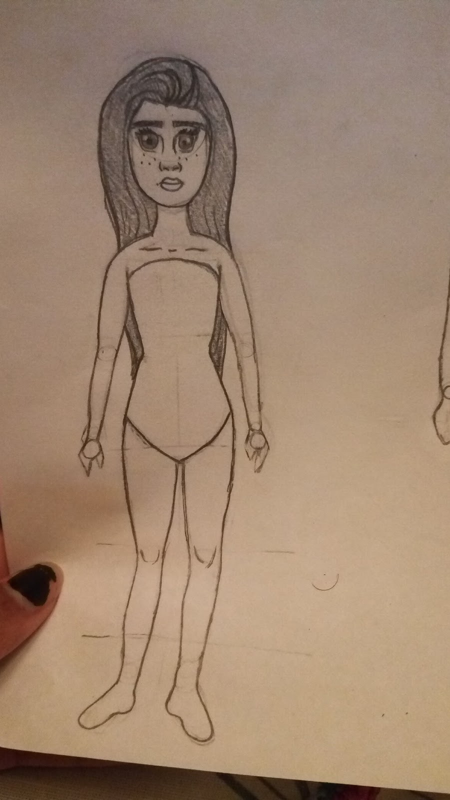
This is my 3rd blog post about the creation of my own characters.  In stage one and two I introduced the special spy duo Vicky and Eric. Stage one was the development of their personalities and qualities while stage two was about creating their face structures based on what we know about them. In stage three its about combing the face and body to create our fully developed characters, including the overall proportions of the body. there are a lot of difference between the proportions and structure of my characters and it took a while to get them just right.

Vicky

When sketching out Vicky's body proportions i started out with the head shape(go to stage 2 for more details), her torso would be the length of two heads and then draw a line there. Hips to pelvic area are another head length, draw another line. Form Pelvic and to knees is another head length and same for legs to feet. Overall her body is 4 heads long, not including her neck which should be half her neck and as long as you think is good. From her neck go straight down to her shoulders who should be about the width of her head but 0.5 cm longer on each side. Leaving the shoulders as they are and move on to the torso, making the chest area curved go straight down and make a curve where you desire the hips to be, from there go out and continue moving out to the the outer pelvic area making it into a curved point. Going back to the arms and shoulders, draw circles on either side of the on the same line as the hips for the elbows and a little bit below the pelvic area. Connect the each side of the circles to the shoulders to create the arms. "Don't make the whole arm the same width, starting form the shoulders make the arm a thicker and slowly decrease it whist going downward" (Brooks 53). The wrist should be the thinnest part of the arm. Go back to the pelvic area and start on the legs,draw two circles where you drew that line for her knees. The thighs can be as thick or thin as you like, but the  outer section should curve into the knees no matter what. Tip: The shins and shouldn't be straight lines curve them out a bit from the knee to show calf's but thin them when heading for the ankle. Hands and feet are not really important at this step, they will be talked about more ins stage 4 and 5. After the sketch of the body is done you can go back to the face and copy what you did in stage 2. After you are satisfied with the drawing you can erase all the circles and put in marks to signify where the elbows and knees are.


Eric

Eric's sketch is a lot similar to Vicky's without all the curves. Again start with the same head shape from stage 2,from there make the neck a little thicker than Vicky's because men tend to have thicker necks then women and make it as long as you want.  Do the same head length proportion lines to decide where the torso, legs, and knees would go. Eric is about 5 heads tall. The shoulders should be a lot broader than the females so you can draw lines a few cm away from his head down to where his shoulders should start. Draw lines from the neck and downward in a slightly slanted angle and stop when you hit the lines. From there stop and move down to the torso, "the male torso is a lot straighter than a female torso" (Brooks 53). Curve the chest a bit inward and then you can basically go straight down from there to the pelvic region. Go back up to the arms and follow what you did with the circles in the female figure drawing, but make the base of the arms a little wider to show that the character has muscles. Tip: Male Wrists are a lot wider than females so don't make it the same size as the females characters. I made Eric's wrists twice as larger as Vicky's if that helps.  Moving down to the leg region follow the same basic skills you used of  Vicky except a males legs don't curve in as much towards the knees as a females. Calf's and knees should be larger, depending on the height of your character. After your done with the body head up to the face and copy the face that you created in stage 2 for your character. Once done with the overall produce yo cna erase all the guidelines an circles to make your drawing look more professional.


That was it for Step 3, come back for step 4: Designing clothes for your Characters. 

Was it easier to draw your female or male character? What part was the easiest and what part was the hardest? 

Brooks, Josiah. Draw with Jazza - Creating Characters: Fun and Easy Guide to Drawing Cartoons and Comics. Impact, 2016. 


Sunday, December 31, 2017

Creating my own characters: Stage Two Face Structures

Creating my own characters: Stage Two 

Face Structures

In stage one I introduced my characters Vicky and Eric and developed their personalities as well as stated their relationship. Here is my second blog post about the process of creating my cartoon characters, in this stage is will explore the possible face structures of my characters and their personalities. Since one of my characters is female and the other is male there will be distinct differences in face structure, so I focused on them separately rather than together.

Eric

When developing Eric's face structure I kept in mind that he was  a male with an edgy personality on the outside but a big softy on the inside. Its important to develop a familiarity with the more 'common proportions' of the skull/head. (Brooks 34) When drawing him I keep a rough sharp edges for his eyes and his jawline as well as his eyebrows.  His jawline was extended to a sharp point while his cheekbones were less defined. I kept his cheekbones the same while softening up his jawline but kept his eyes angled and sharp, in a somewhat anger mood. This could be interpreted as him being angry at the world or his teenage angst. For Eric's hair I kept it it short and choppy with a little hair hanging like Johnny Depp's character in the movie Cry Baby. Just for fun I added a few piercing and scars to give him an overall bad boy look.


Vicky 

Personally I found that drawing female faces are a lot easier than drawing males.  her faces shape is an oval round face with freckles. The main feature that I wanted to show through Vicky was her large doe like eye, on her long faces, her eyes give her the appearance of innocents that will work to her advantage as a spy later on in her story. Her small petite nose and mouth work also as a character contrast to Eric who has a larger nose and mouth and an also larger personality. Vicky's are her only angled feature, unlike Eric's eyebrows she has a sharp point at the end. Her hair works as a way to frame her face give her a small appearance, her whole appearance is an opposite to her personality that is sassy and sarcastic, the dangle earring plays as small symbol of her personality.

Tips: "Shading and angled features make the development of the character more noticeable." (Brooks 32)

What would your characters faces look like? Would their personality match their faces?
Brooks, Josiah. Draw with Jazza - Creating Characters: Fun and Easy Guide to Drawing Cartoons and Comics. Impact, 2016. 
Wednesday, December 27, 2017

The Art of Manga: Traditional Japanese Clothing

Traditional Japanese Clothing 

Differences: Male vs Female

Within all aspects of culture and especially art, there are distinct differences in gender. Some may argue that this shouldn't be the case but currently and traditionally those distinct lines are still there. However, male and female traditional clothing stems from the same style. Both are made of a stiff fabric and both have a very modest design. According to the author, "A yukata is a traditional Japanese outfit meant for summer wear and is usually worn at festivals... and not waistline showing"(PetrovicÃŒ 69). The hidden waistline shows Japanese values of female innocence. A male yukata is very similar except for the thinner belt. 

My Struggles in the Drawing Process 

Fashion is one of my biggest interests, one of my favorite things to draw is fashion illustrations. One of the hardest things for me to do was switch the values I was focusing on. For example, in modern-day American fashion, a female's waistline is showcased and accentuated rather than hidden. Another struggle for me was drawing male fashion and trying to include broad shoulders and fewer curves. 

The drawing process as a whole was pretty simple, the basic design was easy to capture and I really enjoyed learning about my culture and this new found art style.  

Traditional Yukata, Male, and Female 
What's your favorite fashion style?


PetrovicÌ, Mina. Manga Crash Course: Drawing Manga Characters and Scenes from Start to Finish. Impact, 2015.


Drawing a Photo-Realistic Male Portrait

                                                        By Lauren Davis


One of my personal favorite techniques is making a photo into a drawing. Drawing photo-realistic portraits is a fun challenge for any aspiring artist. Along with trying to recreate a photo, this picture also applies the intricate and difficult techniques of a front male head. This is very different than the methods for a female head. The author, Jack Hamm, told the reader "Observe the interesting changes of planes in a face- look for them in the male head- and strive to record them." (Hamm, 35) This is my finished drawing, and the picture it is based on. (The photo is of Oscar Isaac, an actor whom I love from his role as Poe Dameron in Star Wars.)


Step 1- Outline and Shape 

 The first step in drawing a photo is the get the shapes just right. This can take a lot of trial and error, and that is great as long as the finished product looks like you want it too. You have less creative freedom when doing this, but it is a fantastic way to practice skills and techniques.
The eyes are always an identifying feature in people to make sure you get the lighting in the right place and the pupils at the right angle.
Hamm recommends trying different observing depth, width, lid formations and wrinkles in your drawing. (Hamm, 34) Then you are ready for the shading. 


                                                        Step 2- Shading 

  Shading a male face has many subtle differences from a female. Making the face appear masculine can be tricky and time-consuming. Hamm said, "Highlight strip above brows, upper eyelids hid, inside the eye in full shadow, set lines of mouth accented by double parentheses in cheeks, strong skeletal feeling beneath the flesh." (Hamm, 35) After shading in features, I had to shade the beard. Stubble can be hard to draw but it was an important part of this photo. Start with adding pigment, and then add texture and hairlines. 


                                           Step 3- Hair and Finishing Touches


Finally, I had to tackle the curly hair. If you haven't learned by now, I tried my best to get the hair correct but it didn't work quite right. After that, it was final fixes with the eyebrows and lips and done. 


                                                       Final Thoughts 

Overall the book gave fantastic advice on drawing a male portrait. I like the information about shading and shapes. I feel like this is definitely what the book has taught the best so far and I am happy with the information. A couple of my friends recognized who the picture was of without me telling them, so I call that a win. So what about you guys think? Do like this technique or do you have one of your own? Leave it in the comments below. ðŸ”¹


                                                        Citations 


Hamm, Jack. Drawing the Head and Figure. Time Warner International, 1963.
“Oscar Issac .” Creator/ Oscar Isaac , TV Tropes , tvtropes.org/pmwiki/pmwiki.php/Creator/OscarIsaac.


Tuesday, December 26, 2017

Drawing a Side View Face with a Four Square Method


By Lauren Davis 

One of the more difficult techniques when it comes to female portrait drawing is a side view face. Getting the eyes nose and mouth just right can be near impossible. Jack Hamm recommends this four square method for beginners. Hamm said, “You can use it to get the proportions correct.” (Hamm, 30) This the picture I ended up though using this trick and how I got there.  


Step 1 - The Setup 

The first step is drawing a square with a cross through the middle of it. This is how you achieve the "four squares." I used a ruler because I can't draw a straight line to save my life. Then you use cue lines to add in facile features. The author said, "Watch out for how the bridge of the nose may run into the eye if the face is in semi-profile." (Hamm, 26) He warned the artist to keep the bridge consistent with the position based on the face. (Hamm, 26) After drawing the basic shapes you can continue to shading and detail work. Make sure to have the pupil of the eye facing the correct direction and the eyelashes pointing out. Also, remember that the lips go outside the square.


                                                Step 2- Hair and Shading 


After you finish the setup, the next step is very similar to the first drawing. A simple shading process should suffice. By adding places of light and shadow you give your picture life and the illusion of depth. The jawline contour is especially important with the side view. Changing the placement and the darkness of it and the cheekbones will drastically change the shape and feel of the face. Cheekbones and jawline are the focal points of the makeups shading. The nose and lips are less important. I chose a very odd hairstyle for this one based off an example from the book. I was very disappointed with how it turned out but it's not terrible.


                      Step 3 - Final thoughts and Finishing Touches 


For finishing touches, I completed the hair, fixed some of the rough edges and evened out the hairline. Overall, I didn't thank this method was very helpful. I tried very hard to understand the forms that could be helped by the box and struggled to see the use. But I liked the help in getting the eye placement correct and I like the eyebrows better in this piece. I think overall it's not bad and I'll appreciate any help I can get on profile sketches. What do you think? Have you tried this and found it helpful or do you have a better method? Leave it in the comments below. 🔹


                                                     Citation

Hamm, Jack. Drawing the Head and Figure. Time Warner International, 1963.

Tuesday, December 19, 2017

Tangling for Beginners - hollibaugh

The next tangle design was made by Molly Hollibaugh, who named the tangle, hollibaugh, after herself. I'd have to say if  I came up with something, I would like to name it after myself too!

This is the second method gone over by Walter Foster in his book, "The Art of Tangling". Hollibaugh is, "great for filler and it looks especially fantastic when it's drawn small." (Foster, 16). Most tangling looks better drawn small. It's not supposed to be big and obnoxious, just small and detailed.

To do hollibaugh, you draw two parallel lines next to each other, kind of making a stripe. You just keep repeating the parallel lines but draw them underneath each other coming from different angles.


If you don't like the sharpness, "For a softer effect, try drawing your parallel lines as wide arcs instead of straight lines." (Foster, 17) I don't really have a preference as to which I like better, straight or curved lines. I think it depends on what your drawing around it.

Which do you guys like better, straight or curvy lines? How come? What about the background, dots or solid?

Thursday, November 30, 2017

The Art of Manga: Starting Out

Starting Out 

Typically, I am an artist that jumps at realism so before finding my book, Manga Crash Course by Mina Petrovic, I had no real experience in this Japanese cartoon styled art. After flipping through a couple of pages of the cute, colorful, yet sophisticated characters, I decided to splurge and buy the book. That same day I sat down and read through multiple sections of the book, completely enveloped in this new realm of art with open eyes, a fresh mind, and sketchbook full of blank canvases. 

Now you might be asking, what is manga? 

Well, manga is the Japanese name for comic books that originate in Japan, the style of art can be divided into smaller categories that are made for different groups and ages.There is kodomo for small children, shojo for young girls, shonen for young boys, seinen for older boys, and josei for older girls. (Petrovic) 

My favorite subcategory would be josei as it tends to capture both maturity and innocence, in a very beautiful way. I would like to create my art to lean towards this category, as it is the most like my usual style of art, however starting out I think it would be best to focus on shojo, the sweet and innocent art. 

While reading the materials section, I realized I already had all the materials you need! These items include, pencils, drafting pencils, erasers, and inking pens. So let's get into the real art. 

The Female Manga Face 

The first page of the drawing sections writes, "Female faces in manga mostly look like the face of a doll, with a round face, huge eyes, and a small pouty mouth" (Petrovic 33) Contrary to my usual drawings, I knew I had to make these girls soft, dainty, and innocent, forcing me to go about my drawing in a softer way. Choosing to focus on the roundness and extenuated features really helped me to capture this doll type look. 


A side by side comparison of my usual harsh realism drawings and newly learned manga style.

Why do you think manga portrays girls as innocent and dainty? 

Which do you like more, my realism or the newly learned anime? 


Petrovic, Mina. Manga Crash Course: Drawing Manga Characters and Scenes from Start to Finish. Impact, 2015.

Creating my own Characters Stage 1 :)

Creating my own Characters: Stage 1 Discovery

As a little kid I was obsessed with cartoons. Whether it was Scooby Doo or Spondgebob I was always fascinated by the colorfully creative worlds these characters lived in, I wondered how they came to be and who was behind these mischievous characters. As I grew up I learned about animation and bringing these characters to life on a TV screen, but it all began with a doodle from a imaginative cartoonists on a sheet of paper. While reading the book Draw with Jazza, Creating characters I remembered my love of cartoon characters the book has helped me lay out step by step how to create my characters and how to develop them.

Brainstorming my characters:
When brainstorming a character you have to go through a character breakdown process. Be clear on creating key aspects of the character both physical and nonphysical, "the characters personality will help you develop their physical attributes"(Brooks 5). Start with Personality and Motives. My characters are Vicky and Eric two teenagers a guy and girl, both are secret spies for the US government. Vicky is snarky, sarcastic with a lot of sass, and pretends to hate everyone but once you get to know her shes the softest person. Eric is the schools bad boy, he skips class, spray paints vulgar words on the side of the school building and is all around a intimating guy. Together they create the best spy group in the US, although they argue and insult each other a lot they make good friends.

Basic Body Construction
After I have envisioned my characters and i know their personalities really well I begin to sketch the physical attributes of my characters. Vicky and Eric are in their senior year of High School so they are moving on from the awkward teen stage and becoming adults and their bodies need to show that. I began to sketch Vicky, I covered all the joints, head shape, hips, and overall figure of a girl. Her curvy figure will enhance her sassy attitude and sarcastic comments For Eric I focused on a slim rather than muscular figure, height and body shaped was more important. He couldn't be really muscular because he needed to be agile and cat like to be a spy but still toned. Eric is going to be a lot taller than Vicky to strengthen their differences.


Body Structure for Vicky


While drawing a females body structure I recommend remembering that "most women have curves and that their body shape is a lot more delicate than males"(Brooks 23). Also remember that females tend to have wider hips than males.


Basic Body Sketch for Eric 

For Eric I made his body a boxed shape rather than a curve like Vicky. Remember to use more angled shapes for a male character.  In my opinion its easier to draw Eric's body because of the lack of curves.
 
Have you ever wanted to Create Cartoons? What Personalities would you give your characters? What Physical features? 

Brooks, Josiah. Draw with Jazza - Creating Characters: Fun and Easy Guide to Drawing Cartoons and Comics. Impact, 2016. 

Sunday, November 26, 2017

Tangling for beginners - flux

When looking in a adult coloring book, have you ever wondered how the artist thought of the designs? Did it just come to them? Where did they learn the skill?

This is what I chose to learn about; The Art of Tangling

The first tangling method taught by Walter Foster in his book, "The Art of Tangling" is Flux. Flux "lends itself to so many uses. Sometimes I use it as a main focus of a piece. Other times, I sneak a bit of it in where I need fill." (Foster, 14). When you use Flux, you can use it for pretty much anything. You can make it be the star of the show and put littler things around it or you can work it in to a bigger piece. For the purpose of leaning Flux, I am going to use it as the main part of my drawing.


"Whenever I get stuck drawing a tangle, I deliberately make a mistake." (Foster, 15). Tangling is supposed to be fun! Don't get stressed about what it looks like. You're supposed to make mistakes, then just use some creativity to build it into your tangle. In fact, In the set I bought the book in, It comes only with two pens and a pencil with no eraser. Unlike other types of drawings, Tangling is supposed to be messy and imperfect. 

Normally, I am kind of a perfectionist. Tangling has helped me relax and see that things can work out, even if it doesn't go as expected. Not everything has to be perfect, it can still look good.

What do you guys think: Does Tangling sound better than drawing for you beginner drawers?

Drawing a Front View Face With the Double Circle Method

By Lauren Davis 

      One of the most important parts of drawing people is being able to portray a realistic face looking straight ahead. Wile being a valuable skill, it can also be very difficult. Getting a correct head shape, well-proportioned eyes and textured hair can be tricky and require a lot of practice and effort. In the book Drawing the Head and Figure by Jack Hamm, he outlines many tricks and methods on how to achieve this task. One is the double circle. He said, "This is a  mechanical method of setting down proportions of the ideal female head." (Hamm, 2) I followed his instructions and drew a basic front view head using example features from the book. 


Step 1- The Head shape and Features

      The book shows an interesting method of getting the proportions and head shape correct. The author recommends drawing two circles and then placing the eyes nose and mouth in marked spaces.
This will give more obvious areas to put the other parts of the face, as seen on the left. After this, I used features from example lists shown in the book. Please note this book was published in 1963 so the style then included large curly hair and very thin eyebrows. The image to the right shows the features added, but the placement marks still there. 


            Step 2- The Chin, Cheeks, and Shading  

      The next step, of course, is erasing the guidelines but afterward, you have to fix and shape of the chin and cheeks. Hamm explains how the cheeks and chin will always vary in shape and size. Some might be flatter or rounder.  (Hamm, 3) While shading the picture you have to add dimension to the face by adding more or less pigment to an area. More pigment gives the illusion of a lower place and less makes the place look higher. The bridge of the nose, chin, and cheekbones are generally the highest, and therefore lightest, areas on a face.


                       Step 3- Hair and Finishing Touches   

      In my opinion, the hair is the hardest part of a face. Getting the highlights and shadows just right can be near impossible. Hamm said, "One of the objectives of drawing hair is to make it look fluffy and weightless." (Hamm, 18) It was the peak of fashion in the 60's. He recommends starting with the shape and the hairline and building out from there. After that, all that is left are the final touches to perfect your picture. 


                                                    Final Thoughts 

      I am happy with the way the sketch turned out but some of the shading is off. I think the method works well with getting the features in the right place, but I wish it helped more with the chin and cheekbones. So what do you think? Is this method helpful to you or do you have a different one that works better? Leave it in the comments below and thanks for reading. 🔹


                                                          Citation 

Hamm, Jack. Drawing the Head and Figure. Time Warner International, 1963.


Sunday, January 29, 2017

New Views

                                           Book's Reference Photo

Face to Face

Seeing as this may be my last post I wanted to not only put in my last efforts to try and create at least an outline of a portrait, but an animal drawing as well. As seen in the photos I started off from a picture of a woman with a layered grid atop the photo. Using a grid did make it easier for me to draw the picture in different parts. It also allow me to be able to not be too overwhelmed by the picture's entire layout. Though the grid did make this whole process a lot easier, I still did find trying to capture the likeness of the photo onto the paper to be quite a challenge. I found it really frustrating to convince myself that I hadn't totally messed up the photo but as I drew in the lines and read the book (Lee Hammond's Big Book of Drawing) I saw it read "I know it looks funny (with the grid lines), but it helps keep things in the right place. Take your time and strive for accuracy." (Hammond 49). So from that helpful advice I continued to finish my outline but I didn't think I was ready to start filling it in just yet.

Seal of Approval

Since I didn't go further on my portrait drawing I decided to take a break from people and promote myself to start drawing animals. In my book when it comes to good animal drawings it states "The trick is using the dark areas and light areas together to create shape and blending to create realism." (Hammond 70). So basically when going about this it's best to know what shapes you're working with when drawing a certain animal and identifying the lighter and darker areas to achieve effective realism.

Seal Drawing
Towards the right you see my first drawing of an animal which happens to be a seal. I really enjoyed drawing such a cute and adored animal, but that wasn't necessarily the only reason I started with it. I believe the book starts out with this specific animal in order to get the reader better accustomed to learning how to shade animals. With this animal especially, it's an essential component to make it look real. Though I am now working with drawing an animal, similar components of drawing people still come into play like with the shaping of eyes and shading.

Closing

It was really interesting to not only attempt my first real portrait while trying to learn and apply the realism techniques I've learned. I also really found a joy in drawing animals which I look forward to continuing in the future. My question to you is if there was anything that you would be willing to learn to draw realistically, and what would keep you motivated to keep trying even if it didn't come out right the first few times? Thanks for reading and feel free to leave a comment below about any questions or critiques that you have, all of it is welcome!

 Hammond, Poly Lee. Lee Hammond's Big Book of Drawing. First ed. Cincinnati, OH: North Light, 2004. Print.


Saturday, January 28, 2017

Tonal Shading

        In the post before, I finished my drawing with the crosshatching technique and I think I've mastered that technique. In the post, I'll be using tonal lines to create a sense of value and depth. Tonal lines are, "shading the light areas by leaving it empty of drawn lines, but darkens the area not hit by the light. The pencil marks in this technique are small and close together" (Willenbrink 84). This to me is easier that crosshatching because what you basically do is create a light source in your picture and shade using shadows that are away from light (Willenbrink 87). When I first looked into it, the first image that appeared in my head was Spider-man because he shows many you have to use use empty lines to create depth.


Instead of drawing the original Spider-Man up, I decided to spice it up a bit and make a new design. This is what tonal shading looks like. You think of where you want the light source to be, and you create a shadow by using a technique of lines and shadows, kind of like a combination of crosshatching, and dark-to-light shading. I think my new design is a little bland, but I just wanted to start off with something easy since it's my first time ever doing tonal shading, at least knowing.


Bibliography: Willenbrink, Mark, and Mary Willenbrink. Drawing for the Absolute Beginner: A Clear & Easy Guide to Successful Drawing. Cincinnati, OH: North Light, 2006. Print.

How did my design, for Spider-Man look? Do you like tonal shading more, or crosshatching?

Thursday, January 26, 2017

Crosshatching Continued

            In my first crosshatching post, I wasn't completely satisfied with the result, so I decided to do another post using the crosshatching technique. In the first blog, I noticed that I didn't add enough lines and cross over many lines to create a clean gradient. So in this blog I'm going to try to blend the two methods that I've done in my past two blogs. This means that I'm going use dark and light shading, along with the crosshatching technique.


  As you can see in the picture, there wasn't much shading like in my previous blogs, but in this one I just wanted to get used to the technique of crosshatching and I think I have mastered it. I said that I was using both which I did because in the collar, and how it contrasted to the shirt. But you can see in his hair that the lines are crossing, creating a soft blend of gray. Although I said this is crosshatching, I should be more specific because their are many ways. This style specifically is a mix of fine crosshatching, and tick crosshatching (Willenbrink 57). The reason why I chose crosshatching is that it has a good composition. Composition is, "the arrangement of elements in an artwork. A good composition entertains the viewer, while a weak composition may make the viewer feel indifferent toward the artwork" (Willenbrink 64). This is why I want to increase my level of crosshatching.

Bibliography: Willenbrink, Mark, and Mary Willenbrink. Drawing for the Absolute Beginner: A Clear & Easy Guide to Successful Drawing. Cincinnati, OH: North Light, 2006. Print.

Do you think I've mastered crosshatching, if not, what should I improve on?

Sunday, January 22, 2017

Drawing the Windows to the Soul

Sight of Interest

Continuing on from my last post on drawing facial parts I decided this time to start working on drawing the eyes of a person. The author of the book I'm using to help me with my drawings (Lee Hammond) makes it clear that the eyes are not only her favorite thing to draw, but also an important part of a picture, so much so that even an entire drawing could be based around just the eye. In my last post I mentioned the book saying it's best to think of a drawing as pieces of a puzzle, which is especially true for the eyes. Lee Hammond's Big Book of Drawing states ". . .the eye is just shapes. An eye looks more like puzzle pieces than any other feature." (Hammond 26).


To expand on this theory of viewing the eye as a puzzle I took a snapshot of the different parts of the eye that make up the whole thing. This was a really useful way for me to understand where to place and draw all the various parts of an eye. To layout what each part of the eye is as seen in the picture towards the right: 1 is the iris, 2 the pupil, 3 the flash or catch light, 4 and 5 are the white of the eyes, 6 the upper lash line, 7 the lower lid thickness, 8 the upper eyelid, 9 and 10 the corner eye membrane, and 11 the eyebrow. All eyes have most of these components, yet they still have their own differences that make them unique from each other. It's explained in my book that eyes can tell a story from how they're drawn, not to mention that they can also tell you a lot about the person to which they belong. That is why I feel that when you draw eyes, every detail counts and adds to the overall final product.

Shedding Some Light 

 The pictures on the right show my first attempts at drawing eyes. I decided to have both be drawn in the same view, instead of a side or slanted view to keep it consistent since I was trying it out for the first time. Both pictures contain the same physical components that an eye usually has and needs, but at the same time they have their own distinct look and characteristics. For example, both eyes also have eyebrows, but one has a much more distinctive arch and defined line, while the other has much straighter and bushier brow. While on the topic of the brow, it's important to note that I didn't just simply color them in. I had to first draw small hairs all pointed in the same direction, not with hard drawn lines, but soft ones. After those are established it helps to fill in the rest of the brow by blending it all out. What stands out to me in both eyes is their catch light (white circles) that give them more of a life like appearance with the help of some shading. 

Views For Thought 

My first try at drawing eyes was very intriguing to say the least because it did help me look at yet another part of a person in a different and unique way than I had never noticed or seen before. The steps I take to complete each drawing help me better understand the inner workings of what I draw and the various ways I can represent it through artwork. I still strive to try and make my drawings life like, but I would like to know if you have ever seen  piece of artwork, whether it be cartoon, abstract, or still life, that has made you see things that you notice in your everyday life differently? Thank you so much for reading, and feel free to leave a comment below about anything I've shared.

References 

 Hammond, Poly Lee. Lee Hammond's Big Book of Drawing. First ed. Cincinnati, OH: North Light, 2004. Print.